http://www.linuxinsider.com/story/V-3—You-Cant-Go-GNOME-Again-72266.html

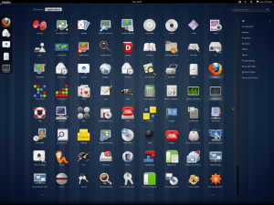
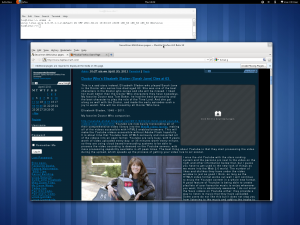
This is the Gnome 3 desktop I have been talking about, I have downloaded the OpenSuse based Live CD and I have actually tried it myself and I have to say it sucks royally. Look at this screenshot of the start menu, this is very hard to use at 1920×1440 pixels resolution, I can not read the icon titles very easily at all. Surely I could change the font settings and fix this, but I am using this as it is on the Live CD and not changing a thing, as described in the link above, this desktop is very different to the Gnome 2 desktop that I actually love to use, it is retarded beyond belief and I can not imagine that too many Linux users will want to use this at all. The screenshot below shows the windows on the Gnome 3 desktop and the lack of minimize and maximize buttons, you have to grab the very thin window border and drag to re size the windows to your liking. And that is annoying, but we can only hope that Ubuntu keep the Gnome 2 desktop around to enable users to switch back to classic Gnome, otherwise people will switch to xfce instead. Which sounds like a good idea in my book, KDE is getting retarded as well, it seems they want to turn users away from desktop Linux by providing stupid bloated and retarded desktops like this for a new users first Linux experience. Do we even want people to use Linux or are we going to turn them away?

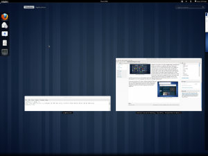
It sure seems to be that way. The Gnome 2 desktop in Ubuntu and Debian and other Linux distributions has always been a good usable desktop and now they want to force another desktop onto the users of various distributions making the first impression of someone using Linux for the first time a negative one. The screenshot below is the activities view you get when you hover the mouse cursor over the Activities menu. This allows you to see all open applications and switch between them. And if you move the cursor to the right, you can access the virtual desktops mode, which at the moment only has 2 virtual desktops. But it is not as much fun as having the two tool-bars as in Gnome 2. Even the Windows 7 interface is better than the Gnome 3 desktop.

I guess they wanted to try something new after Gnome 2 but they have failed, assuming that all of their users are as dumb as bricks and simplifying the interface to a toy-like Fisher-Price interface rivaling the Windows XP luna theme with the green start button and bright blue window borders. At least there is FVWM and E17 desktops still available as well as Windowmaker, the GNU Windowmaker window manager is a very good desktop and is a very fast alternative to the Gnome desktop if you want something fast and easy to use instead of the bloated and annoying Gnome 3 desktop that I have just covered here. And the icewm desktop window manager provides a desktop that looks just like Windows XP with the right themes. I have used larswm in the past, that is a tiling window manager that can be controlled entirely by the keyboard. But for a true replacement for the Gnome 3 desktop, I would recommend xfce as it is light on resources and very usable indeed, just as usable as Gnome 2. KDE 2.2 was perfect as a desktop window manager for Linux, but now it is just as bloated as Gnome 3 and annoying to use to boot, they are just trying to copy Windows Vista and Windows 7 but Windows 7 is way faster than KDE 4.5 and easier to use as well.
Why are you so toxic? Gnome 3 is maybe bad, but you cannot blame its users for their choices.
Gnome3 just sucks ass.
This shit is for tablets.
Try navigating to another virtual desktop.
WHAT WERE THEY THINKING?
Seriously – Gnome 2.0 with Beryl was great. Move to a root window, hit the middle mouse button, and select your desktop by rotating it – or go to a panel, select the desktop.
Now it’s move to the right, click Activities, move across 2560 pixels for me to the far right, select it. What a great idea to make it the furthest possible distance – across your widescreen monitor which is now standard.
MUCH!
MORE!
CONVENIENT!!!
Thank you Gnome development team! You took an efficient to use desktop, and made it much much worse.
Well, this was my try out of Gnome 3.X on VmWare to see what is available now that Gnome 2.0 is gone. I’m going with Mint. Dare I say that even Unity is better? I feel like washing my mouth for even thinking about saying that out loud.
Why did you break a nice desktop? This isn’t more usable. I suppose if I were using a TABLET it might be better, but guess what – I’m using a computer. Tablets are toys. If I wanted a toy, I’d be playing with a stupid iPad, Android, or even Surface. I have an i7 with 32 GB of memory, 3TB HDD and a SUCK video card.
You know what I want to use this machine for? *WORK*. You know, doing stuff to make me money, and there’s nothing more I love is an inefficient desktop to waste my time. WHEE.
I know how to make this better, make a virtual keyboard and require everybody to use it with a mouse. That will be even BETTER Gnome Development Team.
What are you trying to do anyhow? Did you realize you had a great desktop and wanted to sabotage it? Sure seems like it.
I have tried Gnome after using Unity since Hardy Heron. What I have found is that Maps don’t work, Weather application doesn’t work, one has to install ppa’s for unetbootin and wine and libreoffice, because the Ubuntu-desktop and Gnome-desktop are simply not up-to-date and things break. The idea of Gnome looks pretty nice, I love the simplicity of some things, especially night-mode, but some things like the update settings are nowhere to be found. The stuff that is there when you click the settings to get to update in Unity are missing. O, yes and it is very confusing to have three update applications, software, software & updates and software updater and you can also update when in the about this computer panel??? Too much, too many little things. At least when you drop a working desktop like Unity, replace it with something better or have the guts to say this project is a dud so people can change back to windows or buy a mac or something. If all else fails I will install LXDE where one can at least have a desktop that that is functional and find things without wasting countless hours trying to make things work that should work out of the box or if I can keep Unity use that with classicmenu-indicator to make it useable. As a last comment I would like to state that the gigantic top bar of applications eats up way too much space. Why?