How to test a responsive web design with Firefox
If you press Ctrl->Shift->m when viewing a website, it will be switched to a mobile view that allows you to see what the website looks like at various mobile resolutions. I found this out by accident. But this is a very cool Firefox trick. This makes testing a website for mobile customers very easy. The coolest trick in Firefox yet. This will automatically switch a site to the mobile version when you select a mobile device from the list at the top. A great feature for web designers to test a website on the screen sizes of multiple mobile devices. Another way to access this is to navigate to Tools->Web Developer->Responsive Design Mode. A great addition to the Firefox web browser, this is indispensable for testing various website themes on many mobile screen sizes.
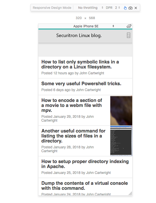
So, you do not need to use many devices to test a responsive website design. Just use Firefox. There is a list of Firefox keyboard shortcuts here, but I could not find this one there: http://www.shortcutworld.com/en/win/Firefox.html. This is very useful for a web designer when wanting to test a new theme or CSS style on many devices screen sizes and resolutions. It is possible to set a different screen resolution on a phone such as a Samsung s20. So this allows this testing as well.